
The colors that you choose for your office have a distinct effect on how people feel and how well they work. While there is always some individual variation, your employees — and you as well — will likely respond to colors in certain ways, and it’s essential that you use colors that will help your employees reach their work goals. It’s tempting to go for the latest fad, but research shows that using specific ranges of shades will win out over using the latest fashionable palette.
Color Can Have Some Pronounced Effects
The idea of using color to influence people’s moods is not new. One of the more famous examples is drunk-tank pink, an intense pink that’s been shown to calm down aggressive people. First used to calm children in Canadian schools, the color was tested on inmates at a facility in Seattle. After 15 minutes of exposure, the inmates were calmer.
That doesn’t mean you should paint your office bright pink if you want calm employees. Remember, drunk-tank pink was used to specifically reduce acting-out behavior from schoolchildren and jail inmates. Your employees need something more subtle that will help their lives, not curtail them.
Goals and Impressions Are Key
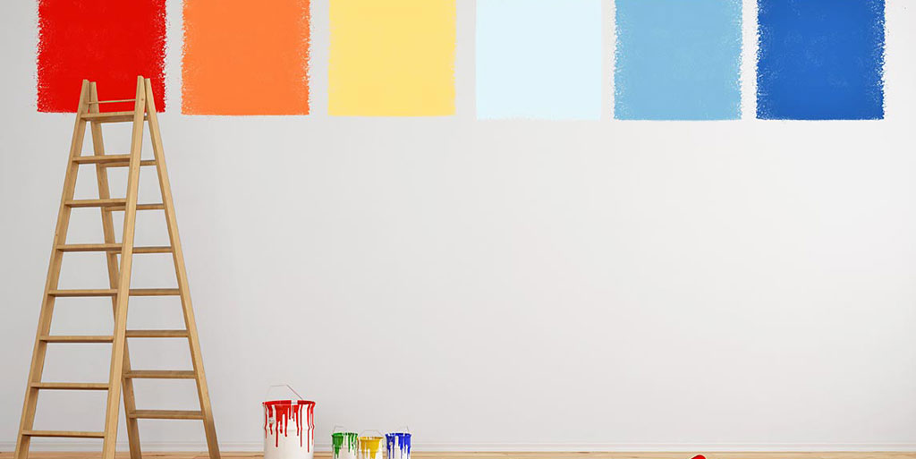
Before you choose a color scheme, look at how your goals for your company, the goals for each employee, and the impression you want your company to give match up. Creative industries will want brighter, bolder colors that keep people working effectively, especially if the work is fast-paced. White and orange accents with yellow as a starring tone can up the happiness factor and optimism in the office.
Tan and beige, on the other hand, give a warm, comforting glow that can be helpful for giving people a more “sober” impression, suitable for legal or financial industries. Blue, of course, is the classic calm-blue-ocean color, letting people concentrate on complex tasks.
Avoiding Visual Noise Is Just as Important
Along with the shade of color comes the shape of the areas where the color is used. Not just the shape of the room, but the size of the wall or the shapes in a pattern. A creative industry that wants to give off a bold, modern impression while infusing employees with energy might use a base of very light beige with pops of green, yellow, and red, but if there are too many pops, that just makes the office look messy and distracting. Likewise, if there’s only one color dominating the room — but it’s an entire wall of bright, bright red coupled with bright red furniture, that can become quite distracting to employees and customers alike no matter the industry.
If you’d like help choosing a color scheme that matches your goals for your company, contact Office Furniture Direct. Experienced staff will help you put together a uniquely personal furniture-and-paint combination.